June 08, 2021
When it comes to design, nothing is underestimated as much as the work that goes into a professional rebranding campaign.
The rebranding process has to be handled extremely carefully and can take months of delicate back-and-forth before it can see the light of day.
At TAKEOFF, for instance – and depending on the size of the company – the typical rebranding process will take approximately a year to develop, and then a few months to roll out.
Why, though? The answer’s pretty simple – if you’re looking for a rebrand, then chances are your business is already established and has been operating for a while in your sector.
That will also mean that you have a large number of core customers who helped you get to where you are today.
Come and see TAKEOFF’s branding portfolio here, and read our success stories!
That’s why a successful rebrand has to take such careful steps; it’s a delicate process because the customers who invest in you on a daily basis need to be considered first and foremost.
You may be looking to capture a whole new audience with a vibrant, creative rebrand that positions your business differently from others in your vertical, but what happens if your existing fans hate it?
You may end up making a small impact on a younger demographic, and have to watch as your regulars flock away in their droves.
A rebrand is more of a delicate balancing act than an outward burst of creative vision. If you’re able to pull it off, though, then the rewards could be huge.
Helping Cooler Master become a cooler brand
Burger King’s recent rebrand is a case in point. The fast-food giant has won plaudits from fans and press alike for its new, retro rebrand. It’s just its old logo, though, right?
A recent interview with designer Lisa Smith, executive creative director at Jones Knowles Ritchie (who handled the rebrand) for Dezeen, shows the immense amount of preparation that needs to go into a rebrand.
Steps range from competitor research, audience feedback, evaluating current media trends, taking brand heritage into account, current design trends, current sector trends, brand perception, cross-channel engagement and many other factors.
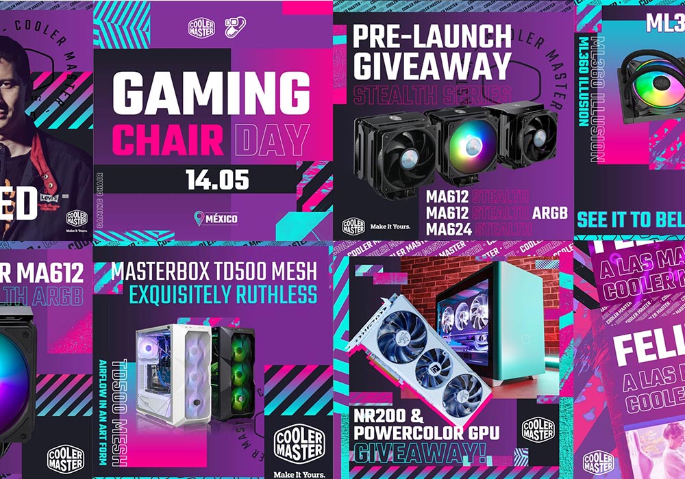
We took those steps and others for a recent brand refresh for PC specialists Cooler Master; a heritage name amongst PC enthusiasts who like to invest in kitting out their rigs with the latest tech.
Keep an eye on our portfolio page to see how we gave Cooler Master a fresh new look!
Cooler Master had a problem. They wanted to attract the next generation of PC aficionados to their brand, but didn’t want to drive away the older demographic that had helped establish them.
Like we say, a rebrand of this nature needs more than a visual overhaul. We spent a huge amount of time testing designs, conducting competitor and audience research, identifying trends and more.
We also had to take into account how the brand refresh would fit into their wider cross-channel marketing strategy, to give it the consistency and flexibility that would be appreciated by the different demographics they were targeting.
The time spent getting the balance right is well worth it. It helps internal teams to understand what the refresh is about, what the message will be, and how it has to be aligned across physical and digital channels when launched.
Not only does that key information help designers create a brand refresh with serious visual clout, but it allows the brand to hit the ground running when it’s rolled out, to reach out to and leave a stronger impression on audiences old and new.
