AUGUST 14, 2018
UNDERSTAND WHAT A BRAND IS.
A brand is essentially a visual identity. A brand is what distinguishes one product / business / service from another. The word ‘branding’ in business terms originates from cattle branding in the USA, where farmers would brand their cows to distinguish one herd from another. Visual identities have been around for thousands of years, in the form of coasts of arms or flags, for example.
Having said that, a brand is not only what it appears to be, it can be much more than just aesthetics, which all comes down to the tone of voice of your brand. We will explain this later down the list.


WHY BRANDING IS IMPORTANT IN THE VIDEO GAMES BUSINESS.
A video game or business without a visual identity creates issues because consumers cannot distinguish one game from another, thus making it not stand out.

Not having a strong brand is like walking around with a bag over your face, there may be substance underneath, but it is much harder to get your point across without showing how you feel. Giving your game a face creates a connection with the player.
KNOW YOUR BUSINESS.
Having a strong mission and vision statement is important so that everyone involved in the company can be on the same page. This means the drive for everybody is the same and the company becomes consistent with what it wants to look like and represent. This is the start of creating a tone of voice and identity for any new brand. See Riot games values here.
KNOW YOUR AUDIENCE.
Having a good knowledge of what kind of person you want your company to appeal to is important.
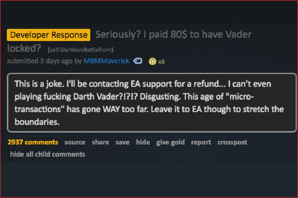
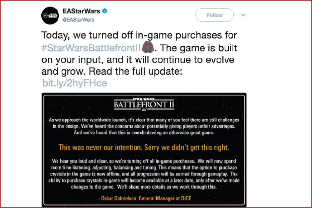
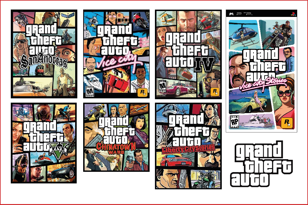
Understanding the culture, appearance and dynamic of your audience is the difference between receiving praise and sales for a brand, such as with the Grand Theft Auto titles, or getting slated across social media and the gaming community, which is what happened to EA after the loot boxes scandal in Star Wars Battlefront. The backlash from not understanding their audience was so bad that they had to issue a public statement and change the game.
KNOW YOUR MARKET.
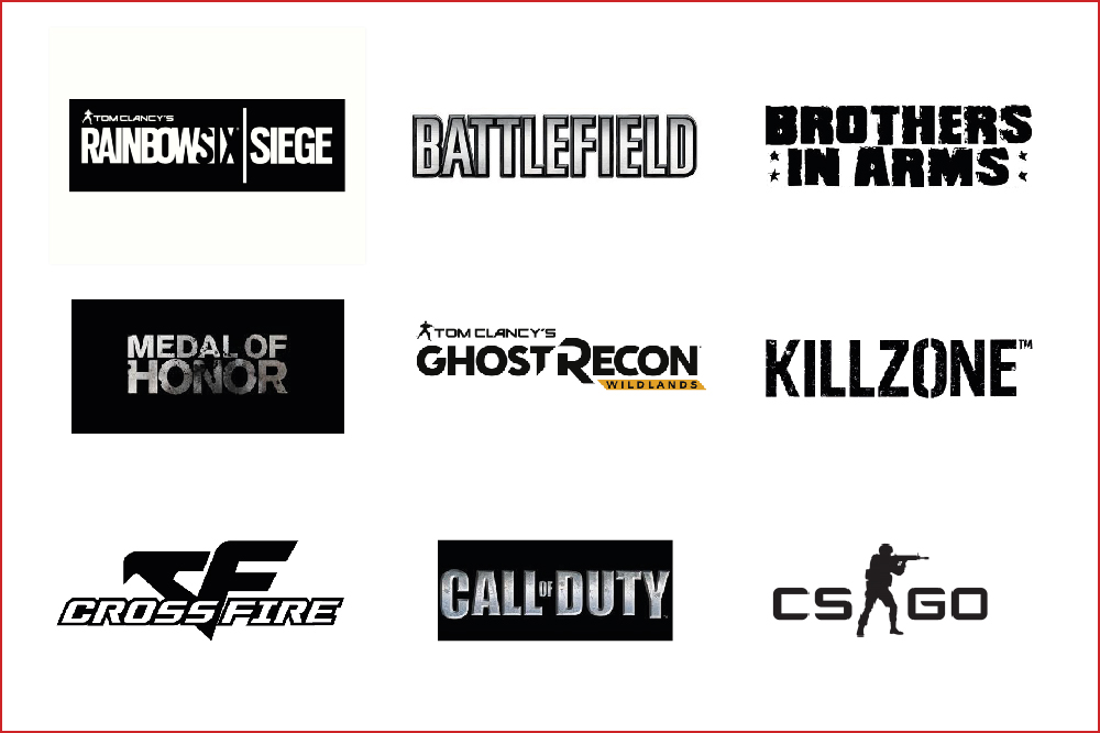
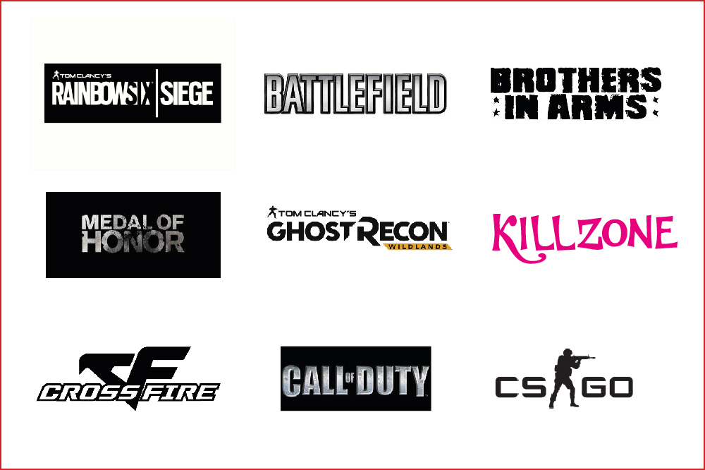
Along with knowing who to target with your brand, you need to know what market your brand will sit in and who the competitors are. This is an important step in realising what your brand should look like.
BE UNIQUE/BE THE FIRST.
It is important to try to have something which makes your brand stand out as unique, the gaming market is diluted at the moment but having a unique element, or being a company who is the first to do something, can really help in the quest to having a successful brand.
Papers, Please is a good example of this, with subsequent similar games such as Not Tonight being described as ‘Papers, Please-esque’. The term ‘Metroidvania’ has also been coined, describing games inspired by the unique design and gameplay of Metroid and Castlevania.
WHEN DESIGNING YOUR BRAND, START WITH A LOGO.
Starting with a logo is a good way to go because it can be placed onto anything, and immediately gives your company a face, colours and style for the rest of the brand can then be loosely derived from the initial logo mark.
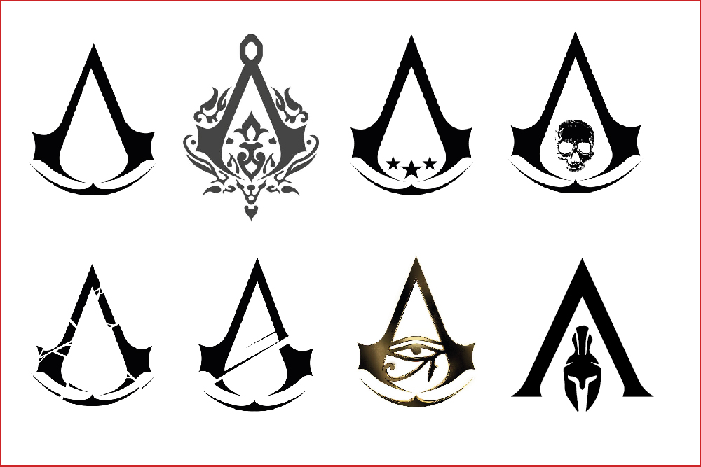
There is a process in designing a logo, they don’t just appear out of nowhere. See the Assassin’s Creed logo design process here.
TOP TIPS FOR LOGO DESIGN.
Here are a few useful tips for designing a successful logo.
- Make sure your logo is representative of your company. It is important that your logo captures your brand identity so that customers can immediately connect with it. A representative logo is the first step in creating your brands’ tone of voice.
- Good logos are usually idea based. This gives your brand image substance before the customer even knows what your brand produces.
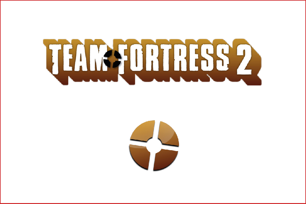
- Logos should be simple, and be able to work across lots of different sizes. The logos of various Valve games are a good example of this, such as Half Life 2, Portal, and Team Fortress 2. They all consist of basic yet recognisable symbols which easily work at any size and can be adapted to fit in any location.
- A common recent trend is to have a logo which is responsive, which allows a more detailed logo for larger sizes, and the logo can then change when it becomes smaller.
- Above all, a logo should be attractive, your company needs something which will lure customers in. There is no point in trying to shoe-horn in an idea if the overall look of the logo becomes tarnished.
CAREFULLY CHOOSE TYPOGRAPHY AND COLOUR.
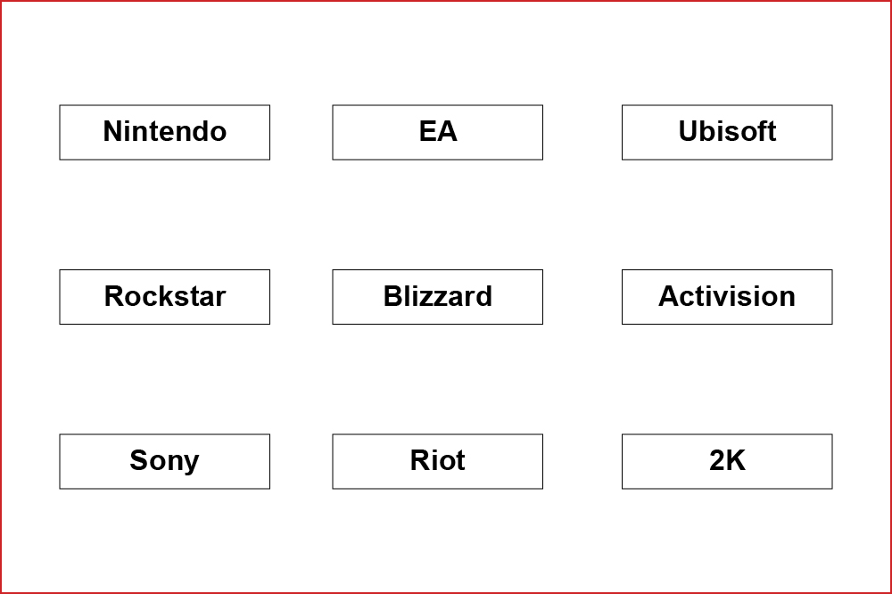
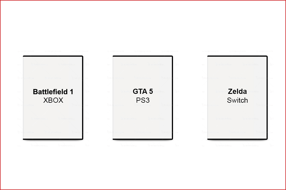
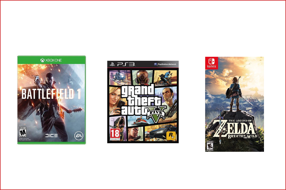
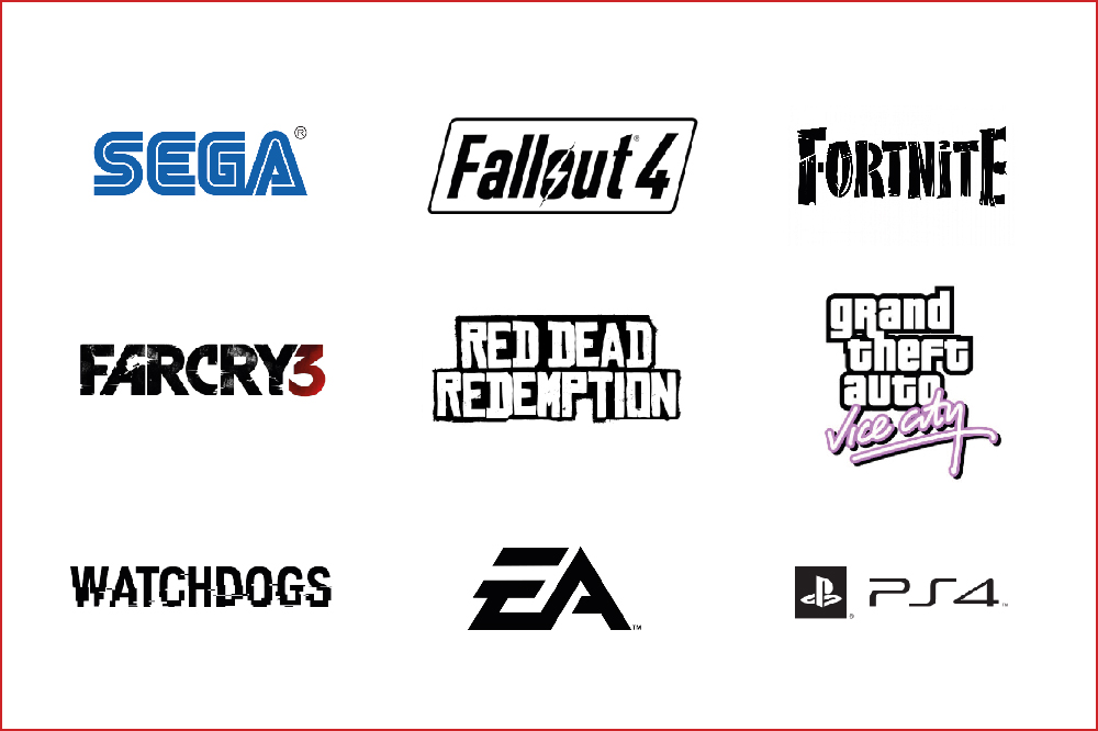
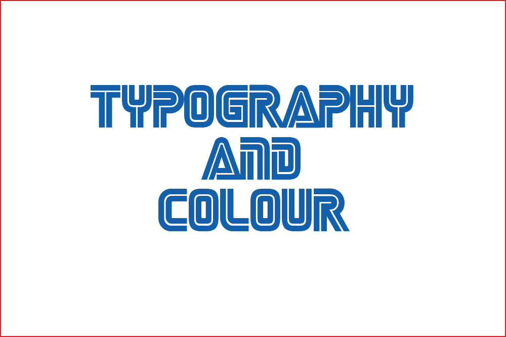
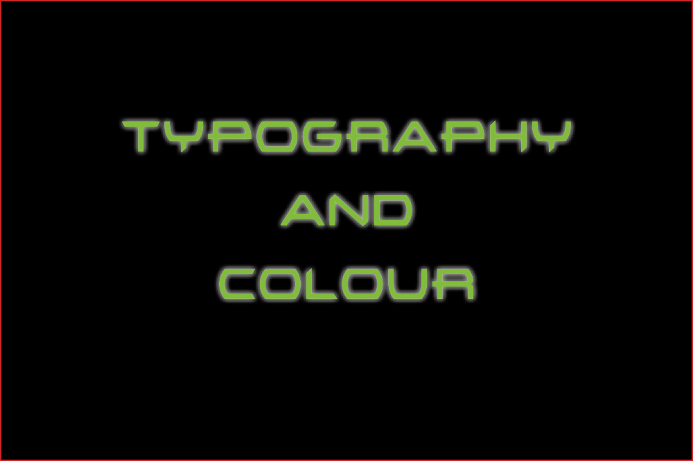
If your logo isn’t on show, you need a way of showing your identity via other means. Typography and colour are, without doubt, the best way to create a visual identity without a logo. You must take into consideration a few of the tips for designing a logo into choosing your typography and colours too. They should be representative, relevant and attractive. They again, attribute to your brand’s tone of voice. Try and guess the brands below just from their typography and colour.
ADD IN GRAPHIC ELEMENTS TO HELP SOLIDIFY THE IDENTITY.
Having graphic elements is a good way to extend your brand without just slapping your logo all over the content you produced. PlayStation takes its classic buttons from the controller for its PS4 graphic elements.


CONSTRAINTS.
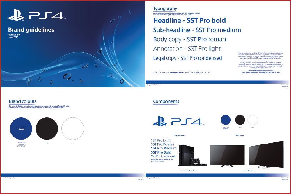
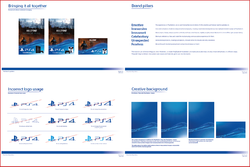
Once a brand has its logo, colour, typefaces and elements all designed, there needs to be a framework to detail what the brand consists of and parameters which the brand has to adhere to.
Constraints are important in a brand because without them, the identity can get lost and watered down.
A brand guidelines is the best way of setting out constraints for a brand identity.
CONSISTENCY.
Once constraints are set up, they can then be utilised and applied to content in a consistent manor.
Consistency is important because it cements the visual element of the brand into the players’ memory, regardless of what kind of output it is created on. Keeping consistency is also good for the tone of voice.
COHERENCY.
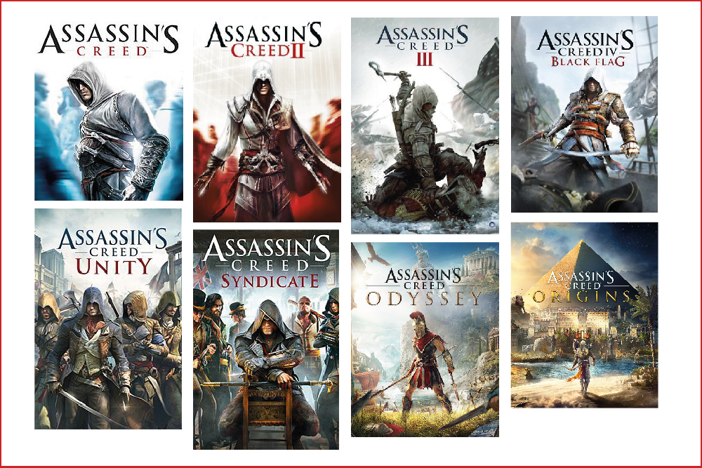
Once a visual identity has solid constraints and has been applied consistently, there then allows space for the brand to be used in a coherent way. This is a newer kind of thinking about the direction of brands. Ubisoft do this with Assassin’s Creed, especially in the later games when the Brand is more established. The key art and logos both change, yet it is still clear what the brand is.
THE GUT FEELING.
Once a visual identity has solid constraints and appearance, your brand will start to develop its own personality, which is what players connect with – tone of voice. A brand will develop from being a visual identity, to being a gut feeling from the player.
Valve has a reputation for creating immaculately produced, innovative and revolutionary games. These are almost immediately considered classics and are loved by gamers around the world. They will purchase any of their releases without question because of their positive gut feeling.
A CHARISMATIC BRAND.
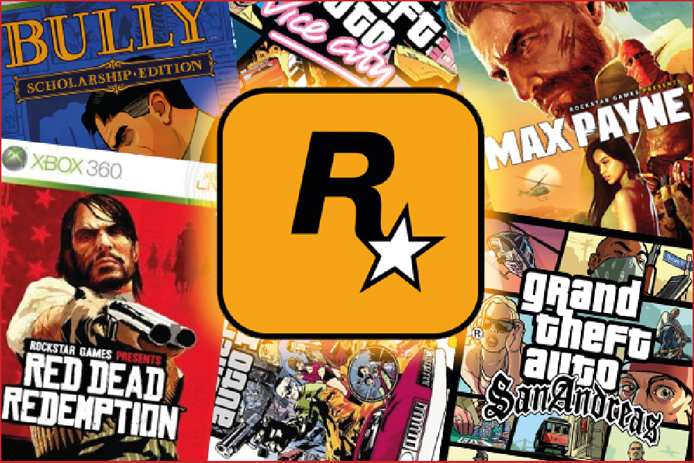
This is the level which every brand should aspire to reach, a charismatic brand is any product, service, or organisation for which people believe there is no substitute. This can be achieved by following the design tips thoroughly, and then conducting business in a moral and ethical manor, then your brand will be able to flourish. Rockstar Games is an example of this as a go-to for action-adventure crime games.
