April 26, 2021
A powerful piece of key art is so important to advertising a video game, movie or other piece of media.
Strong key art is also effective at advertising products and services – think of key art as a single image that acts as a summary of everything you want to draw in an audience.
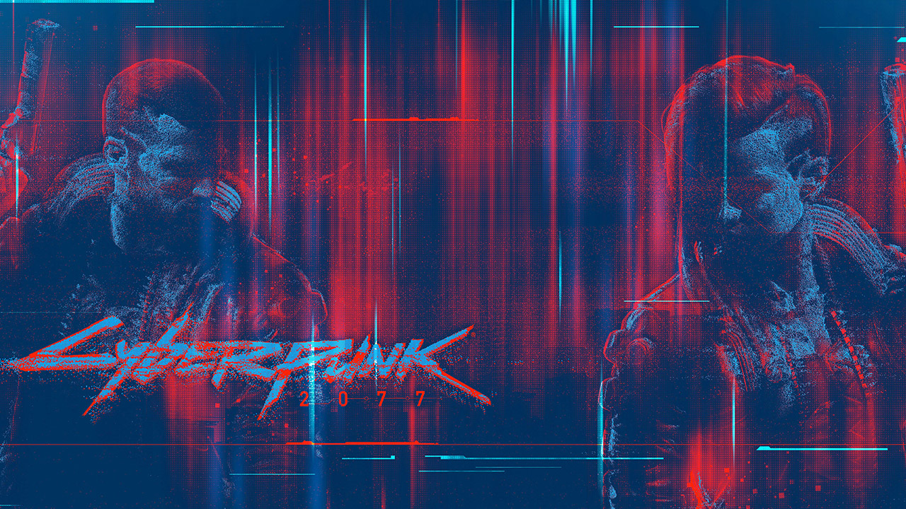
The best key art shows characters, tells as much of the story as simply as possible, has intrigue and should be designed to leave people wanting more.
We’ve written about key art before and some of the boxes that need to be ticked to maximise its full potential and make it clickable – read all about it here.
It used to be that key art was mainly used as posters, magazine ads, bus advertisements and other forms of OOH media.
The role of the internet has changed the responsibilities of key art exponentially, though. There is now more space for ads than ever, and more chances to draw in a target audience.
That also means that there are a lot more steps and formats to consider when creating key art, to make sure that each image is as powerful as the next, no matter what screen it’s viewed on.
That also means that more boxes need to be ticked before key art is signed off. And those boxes can be more technical than whether the image and messaging is attractive enough.
So, what should you look for before signing off a piece of key art in the digital age?
Come and see some of the key art we’ve created for major global media projects!
Formatting considerations for key art images
The best thing to do when considering different formats for your key art is to make sure the foundations are as strong as they can be, first.
We mentioned some of them before – does the image tell a story as quickly as possible, feature key characters and their faces clearly, and encourage your target audience to invest their time in learning more?
Once the essentials are on solid ground, then research needs to be done in where the best places are to advertise, to make sure your key art is seen by as many relevant audiences as possible.
If you’re producing a video game, for instance, then you may want to advertise on your audience’s favourite gaming website.
That could include a site takeover and various banner advertisements. They come in all shapes and sizes – tall, long, thin, square, and even entire site skins.
Can your key art be adjusted for those new sizes to tell the same, powerful story as your original piece of key art? Does the message still carry the same strength in a long, thin banner ad?
How about social media? Is the image strong enough to stop people scrolling through their feed and make them think? How about introducing some animation to the image – would that help it stand out on ‘busier’ sites and social networks?
A piece of key art shouldn’t just ‘look nice’. A respected design agency will always be thinking; about how your story is told, how to tell it in different ways, and how to maximise its marketing potential.
